10 outstanding website menus
- Lena Sernoff

- Dec 5, 2023
- 6 min read

Some websites leave us slightly disoriented, struggling to find the section we were looking for. Then some feel like an effortless browse as if one button intuitively leads us to the next.
When creating a website, the different elements of the page should come together to guide visitors through your site seamlessly and with ease. One element that plays a decisive role in the user experience of your site and greatly affects navigation is the menu.
What are website menus?
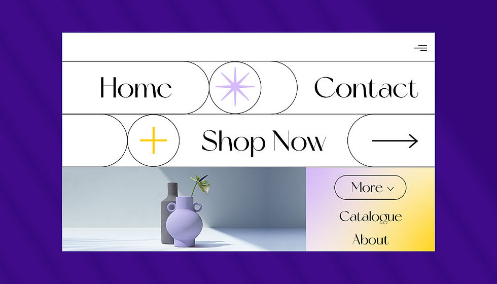
A website menu is a series of linked items that serve to foster website navigation between the different pages or sections of a site. There are several kinds of menus, depending on the website’s content and design. The main types of website menus are:
Classic navigation menu: This most widespread kind of menu is placed in the website’s header, typically as a horizontal list with anchor links.
Sticky menu: Also known as a fixed or floating menu, this menu stays put as visitors scroll down the site. These are ideal for long-scrolling pages.
Hamburger menu: An icon made up of three horizontal stripes that opens up into a menu once clicked. This design convention is rooted in mobile navigation design, but is widely used on desktops as well.
Dropdown menu: A menu in which a list of additional items opens up once visitors click on - or hover over - one of the menu items. This option is suitable for websites with a lot of content.
Sidebar menu: A list of menu items that are located on the left or right side of a webpage.
Pro tip: On websites with abundant pages, a classic menu is often enhanced with breadcrumbs and breadcrumb navigation, helping visitors keep track of their location. A minimalistic option for sites with lengthy content is a status bar, which indicates to the user where they are when making their way through a specific page.
10 outstanding website menus
Below are 10 examples of website menus, built with Wix. They represent versatile and creative uses of the menu in terms of both their website navigation and design. Here they are, for your inspiration:
01. Yang’s Place: On-brand menu that’s easy to access
Chinese restaurant Yang’s Place’s website is fully branded with its logo appearing on the first fold, on the website’s header, and again in its fullscreen menu. The logo on the header stays fixed throughout all of the different pages, leading visitors back to the homepage–a great practice for improving user experience.
This menu is accessible from both in the form of a hamburger menu (which opens into a fullscreen, and a geometrical website layout of photographs and text boxes on the homepage, created using the Wix Pro Gallery.

02. William LaChance: An animated long scroll menu
While there is a classic sidebar menu on this artist’s portfolio, there’s also an additional one made up of images and video boxes that glide into view as we scroll down the page. This menu utilizes website animations and bright, vivid colors to grab visitors’ attention.
This loud and colorful scroll complements the much simpler sidebar, allowing for an interactive browsing method alongside a more straightforward one. Unlike the animations, which are only on the homepage, the sidebar stays put on all of the website’s inner pages as well.

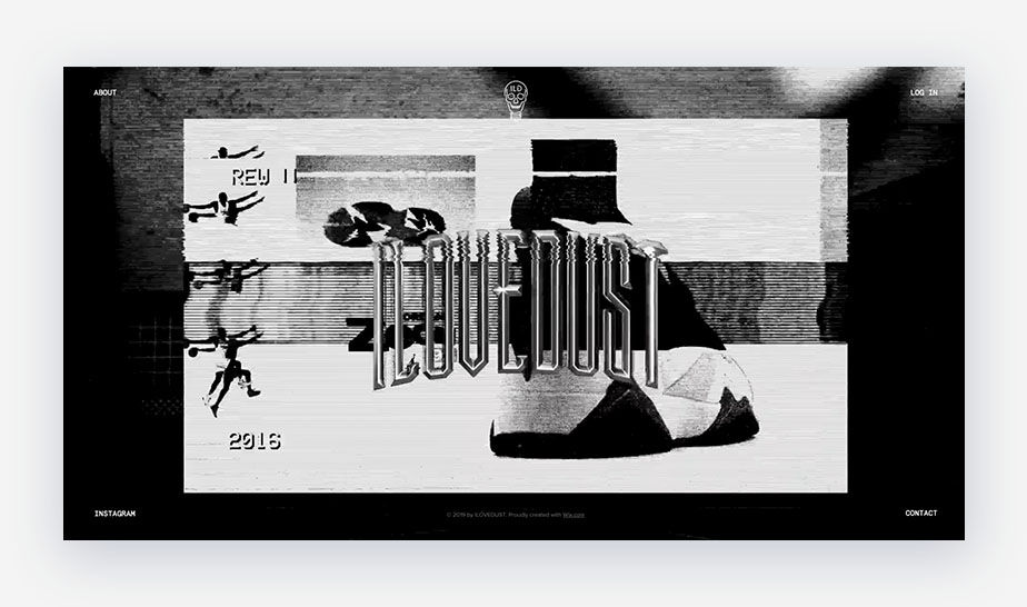
03. I Love Dust: A menu split up across all corners of the screen
This graphic design agency’s website puts on quite the welcoming show, with a fast-paced, fullscreen video that’s a showreel of the studio’s work. In contrast, the website menu remains simple and static, with a different menu item in each corner of the screen.
The split-up menu, a current web design trend, can be achieved by dropping to the sides of your screen.

04. Calvin Pausania: A full-screen menu that makes a statement
As an online portfolio, Calvin Pausania’s website launches into a dynamic, full-screen video upon opening his site.
After clicking the “Enter” button on the homepage, six menu items appear front and center in big white letters. The particular use of this type of typography as well as the website menu placement on the screen is bold and captivating.

05. SQUARE-Urban Legends: A floating menu without needing to scroll back to the top
The products of this online store stand out with their beautifully illustrated patterns, screen-printed by hand. The website’s bright and colorful design, paired with vector shapes and patterns complements the brand’s creative logo.
SQUARE-Urban Legends’ website menu stays fixed on the webpage, acting as a floating menu. There’s also a “Shop now.” button placed strategically in the middle of the homepage which leads visitors back to the website’s product page.

06. Ruby Love: A dropdown menu for an eCommerce site
While specializing in period protection apparel, Ruby Love is a business that offers a plethora of essential items, from underwear to sleepwear and swimsuits. As a result, Ruby Love’s eCommerce website requires a system that organizes and categorizes its many different items. Thus, the site on is a perfect fit because it populates a dropdown menu for each option.

07. Doris Liou: An illustrated menu with surprise animations
This illustration portfolio is filled with hand-made drawings by California-based artist Doris Liou, making its illustrated header menu feel right at home. The menu icons are drawn in pencil, with a small newspaper for the “Illustration” page and a flower for “Social Media.”
When the menu icons are hovered over, colorful animated gifs sneak in and bring them to life. Thanks to another hover effect over the illustrator’s name, we encounter a cheerful little character that’s floating around. That same friendly face also stars in the site’s favicon, tying it all together and adding to the portfolio’s branding and visibility.

08. Adva Santo: Interactive sidebar that’s on brand
The website menu on this online design portfolio by Adva Santo is both unique and interactive. The orange, black, and white menu colors align with the rest of the website's color scheme. When clicking on the different menu items, a line appears on top of the button that creates a “crossed-off” look and allows for a playful and interactive experience. Other parts of the site also show scribbles and handwritten fonts that compliment the menu's “crossed-off” element.

09. Liron Eldar-Ashkenazi: A menu that’s small yet powerful
Upon arrival, this website greets visitors with a bold one-liner across the menu bar: “I am Lirona and this is what I do best.” The quote remains at the top on all the pages, which creates consistency. Liron Eldar-Ashkenazi’s minimalist design website menu includes an “About Me” page and an online store entitled “Shop.”
The designer has simplified the number of menu options, allowing the user to navigate the full site more easily.

10. Roee Ben Yehuda: A menu split into four corners letting the art take center stage
Roee Ben Yehuda states that the goal of his work is to "merge tradition and contemporary design," and his website reflects just that. The site has a clean design with generous amounts of white space which lets his artwork shine.
The website menu is split into each corner of the homepage, bringing the artistic objects to the forefront. The earth-tone colors complement the natural materials, and the uneven splits of his site images carefully blend, resulting in a distinctive look.

Website menu navigation best practices
Website menu navigation plays a crucial role in user experience, guiding visitors through your website and ensuring they can easily find the information they seek. Effective menu navigation should be clear, consistent, and user-friendly, making it effortless for visitors to explore your content and achieve their goals. Here are some key best practices for website menu navigation:
Simplicity: Strive for a simple and intuitive menu structure that is easy to understand and navigate. Avoid complex hierarchies and excessive menu items, as this can overwhelm users and make it difficult to find the desired content.
Consistency: Maintain consistency in menu placement, labeling and behavior across your website. Use familiar terminology and conventions that align with user expectations, making it intuitive for visitors to navigate regardless of the page they are on.
Visual hierarchy: Employ visual cues to establish a clear hierarchy among menu items. Use different font weights, sizes, and colors to differentiate between primary navigation categories, subcategories, and individual links. This visual organization guides users' attention and facilitates easy scanning.
Mobile optimization: Ensure your menu navigation is optimized for mobile devices. Use responsive design principles to adapt the menu layout and interaction to different screen sizes and touch-based input. Consider using expandable menus or hamburger menus for smaller screens.
Contextual navigation: Provide context-sensitive navigation options that are relevant to the current page or section of the website. This could include related content suggestions, breadcrumbs, or quick links to frequently accessed pages.
Accessibility: Make sure your menu navigation adheres to accessibility guidelines. Use proper color contrast, clear font styles, and alternative text for menu items to ensure it is accessible to users with visual impairments.
Regular evaluation: Regularly evaluate the effectiveness of your menu navigation through user testing and analytics. Gather feedback from users and monitor metrics such as click-through rates and bounce rates to identify areas for improvement.
Seek inspiration: Stay updated with current trends and innovations in website navigation. Observe how other websites with similar goals and target audiences approach menu design and consider incorporating effective elements into your own navigation structure.


Comments